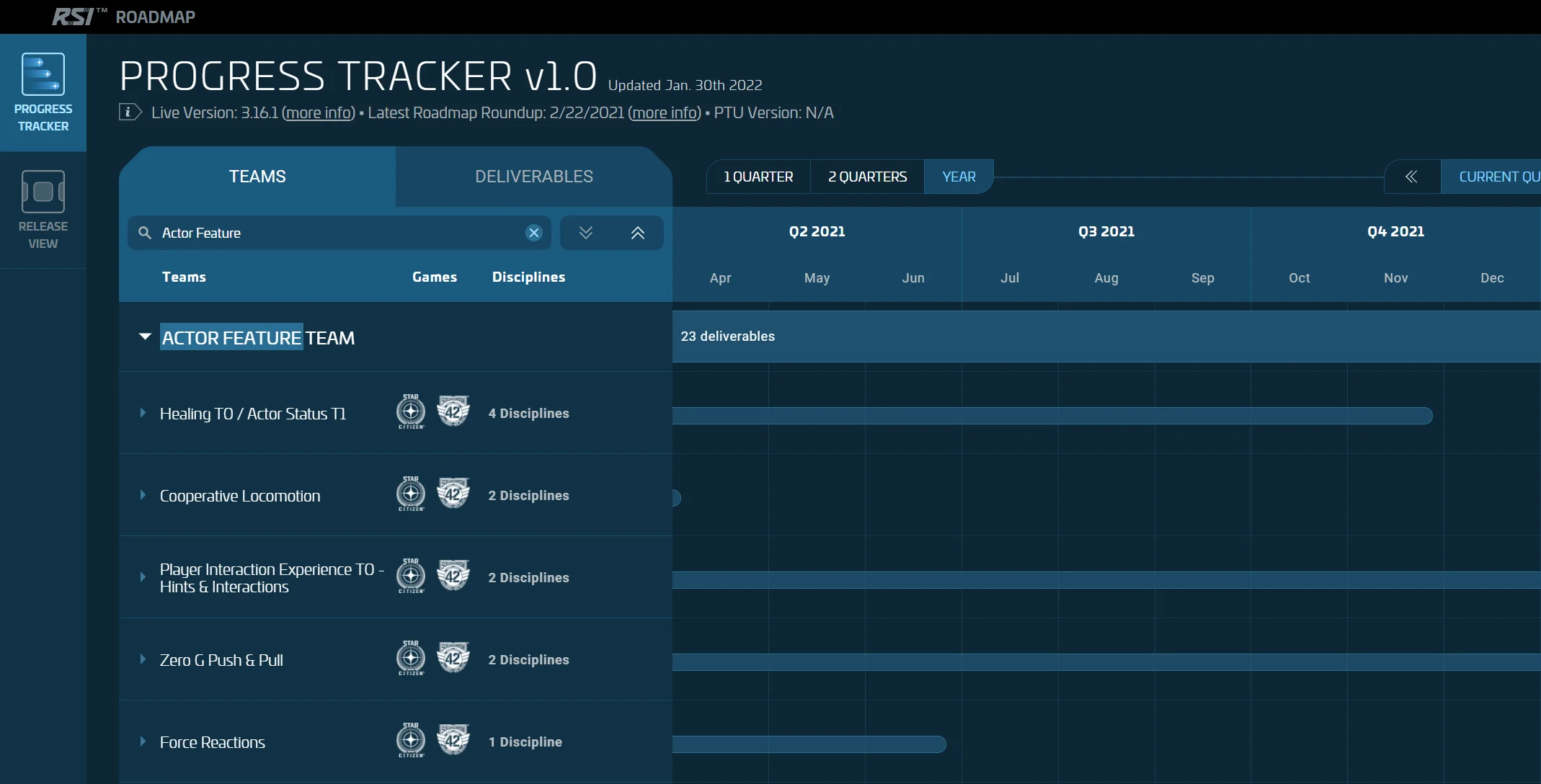
The Star Citizen Progress Tracker had to give the community a fuller view of development work. In a frontend and backend pair, I built the complete V2 frontend: Apollo architecture, a Gantt view, search, filters, and navigation between teams and deliverables.
Making the plan navigable
The public Star Citizen roadmap brings together teams, deliverables, and work periods across several quarters. It lets visitors browse the plan by team or deliverable, then move to the related information.
The first Progress Tracker release presented twenty teams and more than two hundred deliverables. The public guide updated in June 2023 later documented more than fifty teams and over five hundred deliverables, alongside search, filtering, and complementary views.
Volume and uncertainty
The Progress Tracker had to display more information while making its level of certainty clear.
In agile development, a planned work period can change. A dependency can move a task and priorities can be reassessed. The interface therefore had to make planning accessible without suggesting that every item represented a guaranteed release date.
Challenges included the number of rows, loading and transforming data, linking teams and deliverables, offering several entry points into the same information, and grouping dates, months, and quarters on the frontend.
The frontend I built
I was the frontend developer in a pair with a backend developer. I built the complete V2 frontend, from Apollo setup to the Gantt view.
I implemented filters, search, team and deliverable views, detail panels, and navigation between them. The frontend had to absorb a large data volume while some time-based groupings were not prepared by the backend.
Interface and performance decisions
Offer several levels of reading
A roadmap of this size cannot be understood as one table. The interface lets people begin with a team or deliverable, then progressively reveal more detail. This hierarchy limits how much data appears at once without hiding its relationships.
Connect teams and deliverables
One deliverable can involve several teams. Navigation therefore lets visitors move between perspectives without losing context. Team and deliverable views answer two different questions from the same data source.
Provide tools that reduce the volume
Search, filters, and expand or collapse controls make exploration more focused. I implemented these controls in the V2 frontend, together with navigation between team and deliverable views.
Render only what is useful
The Gantt view combined virtualization, progressive loading, Apollo caching, and memoization to reduce calls and limit how many elements were recalculated or rendered at once. These techniques served the same goal: keep navigation responsive as data volume grew.
Build the calendar grid with CSS Grid
CSS Grid structured the calendar axis and aligned data across time granularities. Date, month, and quarter groupings were computed on the frontend because the backend did not provide them.
Represent uncertainty
The interface had to help visitors distinguish a work period from an availability date. Hierarchy, labels, and explanations needed to work together to avoid an overly definitive reading of the plan.
What V2 made possible
The delivered frontend made a large volume of data navigable through team and deliverable views and a responsive Gantt grid.
An interface that explains its limits
Volume was only half of the problem. The roadmap also had to make the certainty of each period visible because agile planning can change.
The roadmap distinguished a work period from a guaranteed availability date. Changes of time scale and clear labels made that distinction visible.